Baladin updates its label design
Since 1996, Baladin has paid particular attention to the aesthetics and content of the labels that personalize its bottles. Over the years, the graphics have evolved, maintaining a strong stylistic tradition while adapting to the natural changes in design.
The first labels were created in the small pub of Piozzo thanks to the creativity of a young Teo Musso and the artist Mascia Avanzo, who at the time worked there as a waitress.
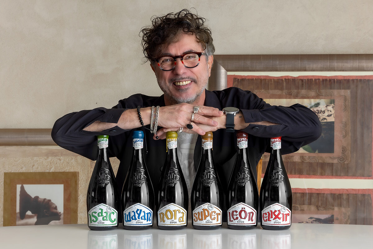
The most distinctive element has always been the lettering: unique, original, and registered as the "Baladin alphabet", designed by Mascia herself. Each beer is characterized by a dedicated color, such as the iconic green of Isaac or the blue of Wayan.
The pentagonal shape of the main label, on the other hand, was proposed by a graphic designer from Piozzo, a regular customer of the pub. This choice recalls the silhouette of a circus tent, a tribute to the interior hall of the historic pub Le Baladin, which was covered by an authentic second-hand tent purchased from a circus company.
At the heart of the design, the predominant element is the beer’s name, intended to be the primary distinguishing feature, independent of the brewery’s name.
Over the years, Baladin’s labels have undergone multiple redesigns, all well-received, thanks to the contributions of various collaborators who have worked on their creation. Today, the latest version has been developed by the in-house graphic team. The result is a reinterpreted vintage design with a more contemporary approach.
The label features a white base customized with stylized floral patterns in soft gray and varnished details, maintaining the characteristic Baladin font. The latter has been enhanced with innovative printing techniques, such as raised tactile varnishes, making the label elegant to the eye and refined to the touch.
Baladin has always catered to the restaurant industry, offering products designed to pair with food, presented in elegant bottles crafted with great attention to detail, providing customers with a visually gratifying experience. This design renewal marks another step forward in this market approach.
The new graphic design has been applied to the 75cl and 33cl bottles of the following beers: Isaac, Wayan, Soraya, Nora, Super, Super Bitter, Leön, Elixir, and L’IPPA.