History and Importance of Labels for Baladin Beers

Craft beer was virtually unknown to the Italian public in 1996. In a country with such a strong wine tradition, where people were used to associate beer to a 66 cl bottle of industrial lager, Baladin had to start an image revolution which would involve an entire category of products, not just one brewery: communicating the quality, identity and added value of craft beer through its labels.
To understand the scope of this change, we need to think back of the world of Italian craft beer of those years: very few independent craft breweries were scattered around Italy, but were only known in their production area.
Craft beer was an exclusive product for the lucky few who could access it, namely those who knew about it and lived in the vicinity of the breweries of the time: Beba in Villar Perosa (TO), Vecchio Birraio in Padua, Birrificio Lambrate in Milan, Centrale della birra in Cremona and Birrificio Italiano in Como, in addition to Baladin in Piozzo, in the Langhe region near Cuneo, famous for its wines.
The desire to restore the dignity of beer and make it recognizable
It was then that Teo Musso, founder of Birra Baladin and the pub that goes by the same name - Le Baladin - and a reference figure for craft beer lovers, decided to introduce his beer to restaurants. With his 600-hectoliter production, he had to expand beyond the local dimension. It was essential to choose the right approach to the market. With higher costs than industrial manufacturers and consumers who were rarely willing to spend a lot on beer, Teo knew he had to be competitive, but he also realized he had to look at the world of wine for inspiration. His labels had to clearly stand out from all others.
After closing time, night shifts began with graphic designer Gabriele Pucci and illustrator Mascia Avanzo, who at the time was a waitress at the pub. A lot of hard work went into creating the visual identity of Birra Baladin, initially inspired by playing cards.
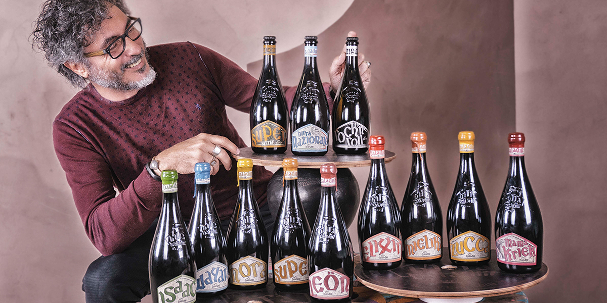
Later, the current, Celtic-inspired font, and the iconic shield-shaped label were chosen. This look is somehow connected to the Italian perception of beer and proved successful right from the first experiments with Super and Isaac, the first two craft beers sold in a bottle.
In July 1997 - in a corner of the circus chapiteau of the legendary pub in Piozzo - Teo, Gabriele and Mascia had developed what would become the look of Baladin forever. Most importantly, they had laid the foundation for a revolution in perception: the image of (craft) beer would never be the same again. Ten years later, about fifty breweries would “dress” their products taking inspiration from the style of Baladin. Everything about the Baladin bottles suggested a different drinking experience than what the average consumer was used to: the elegant profile of the bottle, the 75 cl size (just like a bottle of wine), the capsule wrapping the cap (now replaced by the more natural shellac).
Modern editions
Since 1997, the graphic look of the Baladin brewery has evolved: the labels have become more and more refined, minimalist and lean, while preserving a highly recognizable identity. People have changed too: Marco Bailone has taken over from Gabriele, for instance.
Over time, the various interpretations have used more and more ideograms; laminated labels were introduced (in 2005); we have developed a specific look for our “couch beers” - the Xyauyù barley wines - to express the refinement of the product, while preserving the key elements of the Baladin visual identity.
The most recent evolutions are the result of the in-house design team’s work. Alessio Franzoso and Elena De Toffol have been able to modernize the design by reinterpreting the original lettering and using modern printing techniques to give more depth to the characters and make them more easily readable.
Such a complex identity, though, involves much more than labels alone: logos and slogans have also played an important part. Think of the Open Baladin ellipsis, the logo that identifies the pubs in Rome, Turin and Cuneo serving craft beers by many Italian independent breweries, as well as the ones from Piozzo. It perfectly expresses the idea of being open by making reference to a satellite.
What about our slogans? The first one was “Evolving taste” and it came out at the time of the initial, excited search for high quality, non-standard products. A search for a taste that was evolving. Then "Live beer” followed, to emphasize the importance of not using pasteurization. Recently, with the creation of Nazionale - the first 100% Italian beer - Baladin takes a very clear stance: the importance of directly controlling the entire production and distribution chain, hence: “From the earth to the glass”.


